Classic Star Trek was seldom really able to visually create the feeling of exploring new worlds in outer space. It succeeded in spite of budget constraints and technical limitations, off the strength of its ideas, its characters and its writing.
In adapting Star Trek for Magic: The Gathering, I imagine Wizards had a difficult choice to make. Would they try and capture the vision of Star Trek in the classic fantasy art style that Magic is known for, or would they aim for something more in keeping with the actual shows, despite the fact this might not be so visually appealing?
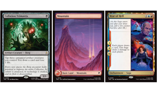
When the first Star Trek spoilers began to come through, it looked as though WotC had gone for the latter in everything except the environment (it was immediately clear that the land art would be great) and like many others I feared this would be a spectacularly ugly TCG set. However, in the end, it’s much more of a mixed bag. There are a ton of great pieces and a lot of variety in the compositions and styles used. The Borg in particular look wonderfully sinister, but I also like the starships, the sagas and most of the deliciously retro artifacts.

For an adaptation of a show that’s not known for its visual flair, and which features talking more than action (indeed that’s a major part of its philosophy) MTG Star Trek has pretty good, varied art. The place where I can find most fault with how the set looks is in its legendary characters. This is where the art is most off-putting, least imaginative, and we have to suffer an endless parade of people in chairs.

There are a couple of different issues at play here. For starters, it never feels nice to see real people depicted on Magic cards. While some cards, like Captain Jean-Luc Picard have threaded the needle, with an illustration that is immediately recognisable as the character without just being Patrick Stewart, for others the legendaries have a photorealistic art style that creates a feeling of uncanny valley.
It doesn’t help that the legends seem the least likely to be doing… well… anything at all really. Often they’re just peering out spookily from their square little windows. Creepy!
I think the reason for this is easy to diagnose. Compare the card Energize, which shows endangered crewmates being beamed up from a beastie’s maw, to the card showing beamer-upper-in-chief Miles O’Brien.

The cards are night and day, one a dramatic scene, the other an accurate representation of Colm Meaney standing glumly in his little room. Wizards can get away with doing the former for generic characters – the card shows the sort of situation that we might assume is happening in Star Trek all the time, but which we rarely see on screen. However, it might seem wrong to show O’Brien in a similarly high-octane, jeopardous situation, if he hasn’t appeared this way in an actual episode. Giving these characters more action on their Magic cards than they genuinely experienced would be misrepresenting them.

Unfortunately, this leads to perhaps a dozen or more cards that are just ‘uncannily photorealistic human sitting in chair or looking at computer’. There are exceptions. Commander Troi, Gowron, and The Traveller stand out to me as particularly imaginative depictions of legends. But for the most part this is where I think the Star Trek set’s art suffers worst. It’s perhaps a shame, therefore, that Universes Beyond sets are naturally so packed with legendary creatures.
What do you think of MTG Star Trek? Share your thoughts over on the Wargamer Discord.
 Source: Wargamer