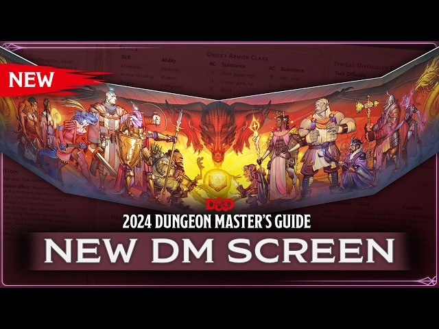
There’s absolutely nothing wrong with the new DnD Dungeon Master’s Screen, which debuts on November 12 for $19.99. Illustrated by Joy Ang, and released in celebration of the 50th anniversary, it features warm and vibrant colors, lots of cool outfits, and a pleasingly symmetrical composition, with the dragon in the center surrounded by varied, interesting characters.
However, while the artwork itself is easy on the eye, it does feel a bit out of place on the back of a DM screen. And this seems to be the consensus view from fans, judging by all the comments we’ve seen on YouTube, Twitter, and Reddit.

I think a line from Trystan Falcone, who appeared in the October 21 video unveiling the screen, is rather telling. “Even though it’s a dungeon master screen, it’s going to have players really looking at the possibilities for characters that they can play.”
This artwork does a good job of showcasing all the different DnD classes and DnD races that are in the game. It’s probably a good thing to show to someone before they enter character creation. I actually prefer it to the alternate cover for the Player’s Handbook – though the party would have to bunch up a bit for it to serve that purpose.
But it doesn’t show what being in a DnD campaign is like. It doesn’t suggest either combat or exploration. In other words, it doesn’t scream ‘adventure’.
You could argue that this is a party about to fight a dragon, and what could be more representative of a Dungeons and Dragons session than that? But the scene is too ordered, and too cozy to read as an actual encounter. It looks like exactly what it is, an excuse to show off a bunch of different characters, portraying all the different options you can pick at the start of the game. Indeed, it’s vaguely reminiscent of a video game character selection screen.
If you look at the older WotC DM screen above, for instance, there’s a lot more danger. The red dragon is much fiercer, the party actually looks ready for a fight. Meanwhile, Beadle & Grimm’s is soon to release a DM screen featuring interesting locations and battle scenes in the land of Greyhawk.
All seem more likely to inspire a party to feats of derring do than this new piece, which is only likely to inspire them past Session Zero.
While the DM screen is a bit overly twee, the 2025 Monster Manual sounds like anything but. Apparently it has plenty of gruesome body horror, which we’re pretty excited about, despite our misgivings about the book’s alternate cover.
To find out what’s coming next for the most famous tabletop RPG, check out our guide to the DnD release schedule.
Source: Wargamer


