Less than one day old, the new Games Workshop webstore is already being derided by online commentators for prioritising style over substance. I would argue that the design differences between the new and old site aren’t failures, but the result of a strategy that doesn’t prioritise diehard Warhammer fans.
The reddit board r/warhammer, an online home to 320,000 Warhammer 40k and Age of Sigmar fans, is dominated by threads deriding the new website. Complaints focus on how ineffective the product filters are, or the way the site prioritises large images and white space without showing many items on screen at once, making it harder to browse models from a visitor’s favorite Warhammer 40k faction or Age of Sigmar army. Features like paint-scheme recommendations for each miniature are missing.
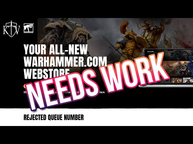
Warhammer YouTuber Kirioth uploaded a video, below, detailing his travails navigating through the site, reporting similar frustrations with the filtering system, and promotional links that didn’t lead to their expected destination. He attributes these issues at least in part to bedding-in problems that may be fixed with patches or data updates.

Prominent Warhammer tactics website Goonhammer posted a snarky tweet summing up sentiment on the website; “Look forwards to our new and revamped Goonhammer webpage, where we’ll be mashing our existing site together with a raging tire fire.”
 Some comments highlight identifiable bugs, expected from a site launch but objectively problems that must be fixed. More comments are responding to how the site has been conceived of and designed; the look, feel, and features of the site. Even if that opinion is the consensus among the online Warhammer fandom, Games Workshop has good reasons not to care.
Speaking in an interview with The Painting Phase, former Senior Hobby Products Designer Tom Hibberd explains that: “Games Workshop’s core customer base is not what most people think it is… we went through as much financial customer data as we could to find out who was buying stuff and the single-biggest buyer of things was thirty to fifty year old women. The mums. And they’re buying it for their 12 to 20 year old child”.

Hibberd’s first-hand information is a little out of date: he acknowledges that the firm’s audience has expanded since he left in 2016. Games Workshop has been successful in reconnecting with lapsed hobbyists in the intervening years – but the mums haven’t gone anywhere.
Hibberd explains the idea of a customer “funnel” in the video. For a company as large as Games Workshop, the best opportunity to make money came from the huge number of potential customers, then the large number of lightly-invested customers. The tiny number of extremely invested fans who talk about it online represent the smallest proportion of revenue.
Considered in this light, the fact that the Warhammer commentariat doesn’t like the new website becomes less important when we judge its success or failure. Features that are unwelcome to the experienced hobbyist are benefits to newcomers, and conversely important features for the veteran hobbyist are less relevant to newcomers or gift-buyers.
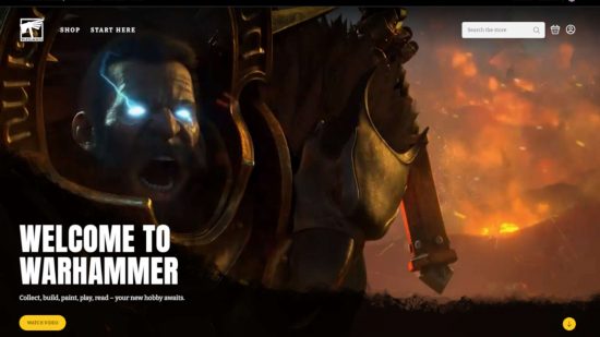
A customer arriving at the new website is met with an animated banner introducing the hobby. For an existing hobbyist that is needless cruft; for a newcomer, that’s a welcome mat, orienting them before they delve into an intimidating product catalogue. Having fewer items on screen at once gives a clearer browsing experience for customers who aren’t likely to engage with the back catalogue anyway. Likewise, the depth and specificity of product filters is less useful for a customer who will mainly engage with starter products, new releases, and deals.
There may yet be bugs and launch problems lingering in the site – just before hitting publish, one of our contributors informed us that the site had lost all of his vouchers, an obvious and pretty severe problem. But this is separate from the intentional aspects of design which are disappointing hobbyists. The new Games Workshop webstore prioritises mums, gift-buyers, and newcomers to the hobby. Whether the site is well designed for that intended audience remains to be seen.
We wrote yesterday that the new Games Workshop webstore is a big deal, and that remains true. It’s one in a series of much-needed reforms to the company’s IT infrastructure, and whether or not it succeeds, it will have a big impact on the company’s fortunes. We’ll be watching closely.
Source: Wargamer


