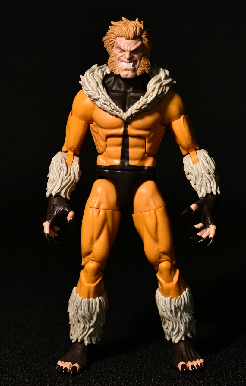
I had a few biases working against this figure, but in the end, there was only one glaring issue remaining. Let’s take a look at Sabretooth’s first costume.


Before Jim Lee and the cartoon took charge of Sabretooth’s overall look, Sabretooth was a lot more streamlined. The excesses of the ‘90s have cemented Sabretooth as a huge dude, which is fine, but I’ve always had more of a fondness for him as not quite so ‘roided out. The 90s Sabretooth we have is on the Hyperion body, and there are many who want him on an even larger body, so clearly there’s a lot of wiggle room for interpretation.

In an ideal world, just based on images I’ve seen, this First Appearance-leaning Sabretooth would have been perfect on the Vulcan body that debuted in this same wave with…Vulcan. Obviously, that was impossible, so one might wonder if it would have been better to wait. Well, Marvel Legends does have a history of not waiting until the absolutely perfect body for certain characters is available, so he’s on what has been called the Reaper body.
I will say that I don’t have the issues with the Reaper body that many have. At most, I think the lack of a smooth transition between the shoulder balls and the arms might be the biggest problem, but otherwise I don’t see much of the issues that people have with this body. It poses very well and it’s got a decent amount of beef to it without being too blown out in proportions. Granted, the Vulcan body looks superior in overall aesthetics—mainly because body sculpts get better over time, and this one is aging rapidly, but the Reaper body just isn’t that bad.
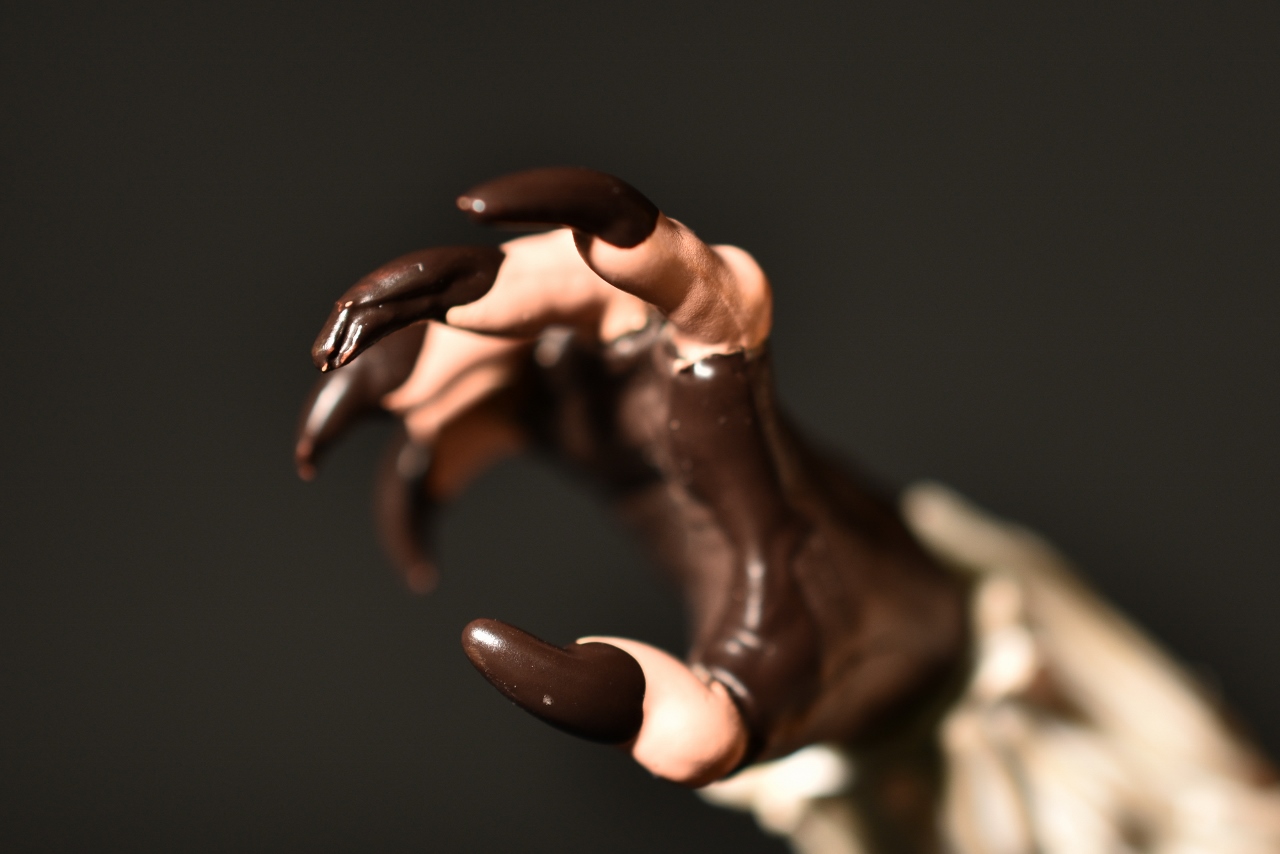
Two things were jarring about this figure. The first, and the one that I quickly got over, was the cutouts for his fingers and toes. For most of the time Sabretooth wore this version of the costume, there were no cutouts, meaning that you got all brown for the hands and feet. In hindsight, that probably doesn’t actually make sense, since all his nails would have to be visible for him to be able to use them. This version of his costume with the cutouts makes more sense from a technical standpoint, but it doesn’t look “right” from an on-the-page perspective. So that was a bias that I had.

In hand, I actually have come around, and I ended up not minding the cutouts. I wouldn’t have minded if they weren’t there and he had full gloves and…footie socks, I guess, but after messing him for a while they stopped feeling as “wrong” as they felt when I saw the initial images.

That doesn’t mean that I still wouldn’t buy him if he was made without the nail cutouts. As long as there was a new head. Which brings me to my biggest issue with the figure, and the one issue that did not go away: that head.

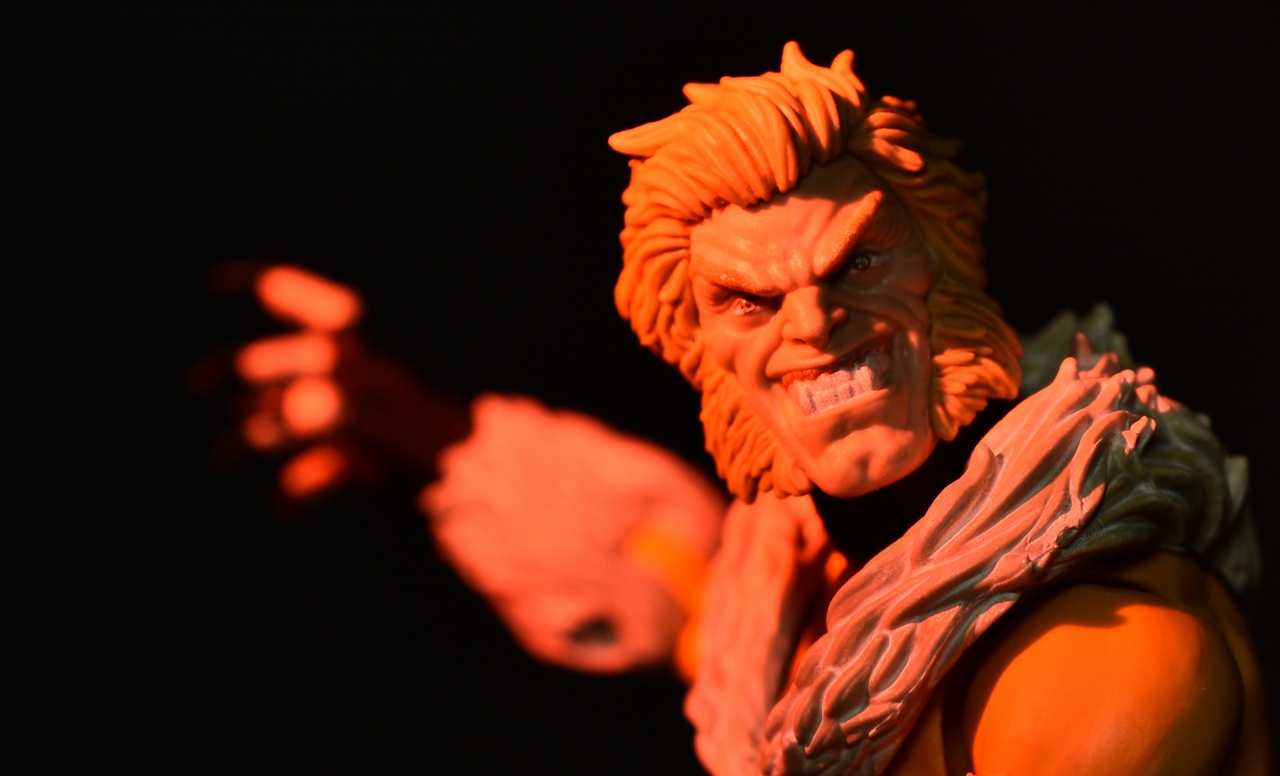
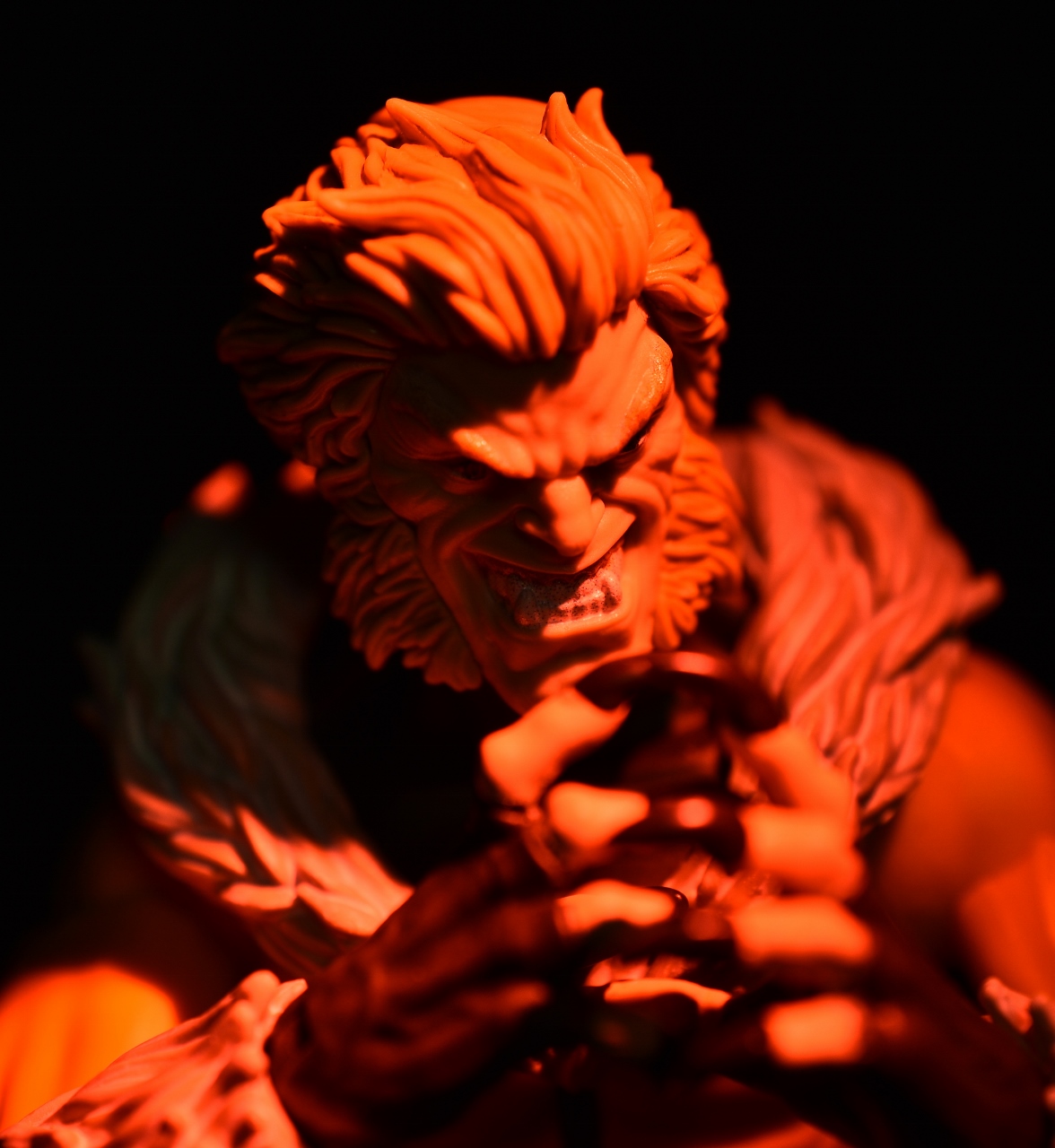
It is very well sculpted. I do not want to poo-poo the work that went into it. The hair is excellent, and the face is definitely expressive. The wild look and all the creases around the crazy eyes are all well done. But from a design standpoint, I just don’t like this head for Sabretooth. I can’t fault it for being dynamic—it is definitely dynamic—but the mouth and the underbite and the expression and everything about it rubs me wrong. There’s no one “correct” interpretation for him, so if you dig this head, that’s great, but for me I took an immediate dislike to the aesthetics of the head and time spent with it in hand didn’t alleviate those feelings. If he’s ever re-released I’m hoping that something a bit more strictly classic is done for him.
Outside of that one hitch, I do like this figure. We’ve had the Jim Lee version and the Age of Apocalypse version lately, so it’s nice to go back into the Toybiz years and update this version of Sabretooth.
Source: The Fwoosh


